When CGI and 2D Animation Mix Like Oil and Water
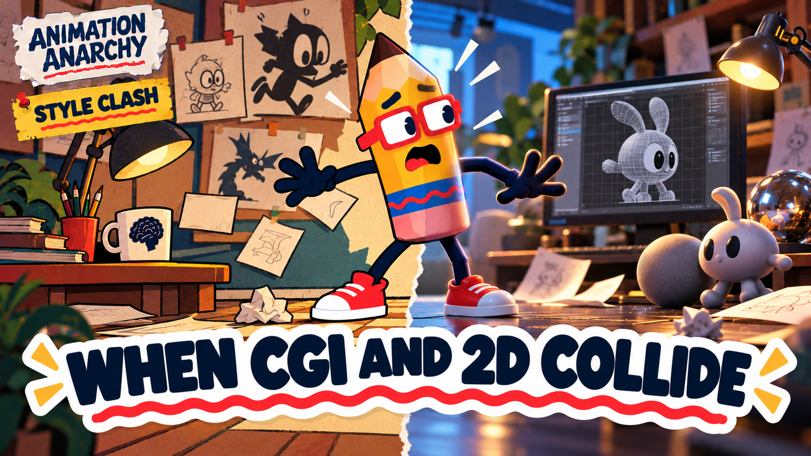
And the few times it worked like magic.
For decades, studios have tried to blend hand-drawn animation with computer graphics. Sometimes it's a bold experiment. Sometimes it's a way to save money. And sometimes the 2D character and the 3D world look like they've never been introduced.
Here's the countdown, from "why" to "wow."
The bumpy ones
8. The Road Runner shorts in The Looney Tunes Show (2011). The main show is 2D, but the Road Runner segments are fully CGI. Wile E. Coyote suddenly moves like a video game cutscene. Chuck Jones's timing was built on drawings, and it didn't survive the trip.
7. Rugrats: All Grown Up! opening credits. The camera swoops around in 3D, and the flat 2D kids stretch and warp to keep up. It looks like an early-2000s effects test.
6. The Lion Guard (2016). Flat characters in front of computer-built backgrounds with different lighting. The characters sometimes seem to float a few inches off the ground.
5. Clifford's Really Big Movie (2004). Computer shading on characters designed to be flat makes them look shiny, like crayons left on a dashboard.
4. The Smurfs (2011). Glossy CGI Smurfs in live-action New York. They look like they were pasted onto the scene with a glue stick.
3. Tom and Jerry: The Movie (2021). CGI Tom and Jerry designed to look 2D, placed in a live-action world. The physics never quite match.
The brave experiments
2. The Beauty and the Beast ballroom (1991). The camera sweeps around a computer-built ballroom while hand-drawn Belle and the Beast dance. It's not perfect, but it was breathtaking at the time, and it showed what was coming. Fun fact: it wasn't Disney's first CGI. That honor goes to the giant clockwork gears inside Big Ben in The Great Mouse Detective (1986).
1. Tarzan (1999). Disney invented a tool called Deep Canvas so animators could paint 3D jungles that still looked hand-painted. Tarzan surfs through the trees like a skateboarder, and it still looks great. The tool later earned an Academy technical award.
When it actually works
The blend can be magic when the computer serves the drawing instead of replacing it:
Spider-Man: Into the Spider-Verse (2018) made 3D look like a comic book, with hand-drawn lines and dots added on top. It won the Oscar and changed animation.
Klaus (2019) went the other way: 2D animation with computer-assisted lighting that makes drawings look three-dimensional.
Treasure Planet (2002) put a hand-drawn cast in a 3D universe and gave John Silver a CGI arm on purpose, because he's part machine. The mismatch is the point.
The lesson: decide which one is in charge
Every bad blend on this list has the same problem: the two styles are fighting for control. Every good one picks a leader. Spider-Verse let drawing lead 3D. Klaus let lighting lead 2D. Treasure Planet used the clash as part of the character. If you mix styles in your own work, decide who's driving.
Your turn
What's the worst (or best) style mashup you've ever seen? Tell me in the comments.
New episodes drop on YouTube first. Subscribe to Mr. Bray Labs so you never miss one.